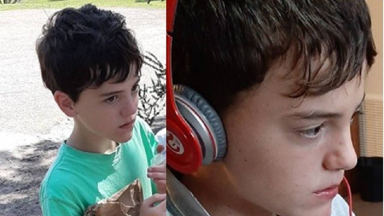
Placeholder Content Image

“A titan of the Australian art world”: John Olsen passes away at 95

<p>Celebrated Australian artist John Olsen has passed away at the age of 95, surrounded by his loved ones. </p> <p>Olsen’s children - daughter Louise and son Tim - were with him, and it was Tim who confirmed the news of their loss to <em>The Sydney Morning Herald</em>. </p> <p>“Apart from our First Nation artists, he changed the perspective and way that Australians looked at our magnificent landscape,” he said. “He was a landscape poet to the end, and a titan of the Australian art world.”</p> <p>Olsen, who was born in Newcastle in 1928, was considered a legend within the Australian art community. An expert across different mediums - from ceramics to tapestry, printmaking, and his beloved painting - his career spanned six decades, and saw him win both the Archibald Prize in 2005 as well as the Wynne Prize in 1969 and 1985. </p> <p>His accolades didn’t stop there, with Olsen earning an OBE in 1977 for his services to the arts, as well as becoming an Officer of the Order of Australia in 2001. </p> <p>“It took a lot of courage to be an artist in those days and he had no hesitation but to run with it and in art he found his calling,” Tim said of his father’s career, and his well-earned achievements.</p> <p>Those in the art community - and beyond - who had the honour of knowing Olsen and his work paid tribute to their friend, and to his impressive portfolio highlighting the beauty of the Australian landscape - a subject which he kept coming back to throughout his career, and one that steered Olsen on his path to inspire people all across the nation. </p> <p>"Sad news,” wrote journalist Hugh Riminton. “I doubt there's any Australian whose eye has not been caught by his work at some point.</p> <p>“John Olsen captured the very best of our country in the most magical way. In losing John, we have lost one of the greatest artists Australia has ever seen,” said NSW Premier Chris Minns, alongside a portrait of Olsen. “And someone who tirelessly championed the arts, as a pivotal part of Australia's cultural identity. A proud boy from Newcastle.”</p> <p>“John Olsen captured the raw beauty of Australian landscapes with his unique style,” tweeted Australia’s Minister for the Environment and Water, Tanya Plibersek. “His bursts of colour and sweeping landscapes have helped shape how we see ourselves as a country.”</p> <p>“Vale John Olsen,” wrote The National Portrait Gallery, before adding that they were “deeply saddened by the passing of John Olsen AO OBE. A gifted painter, John was one of the major figures of twentieth-century Australian art.”</p> <p>“John Olsen was a giant who never lost the twinkle in his eye,” said Australia’s Prime Minister Anthony Albanese. “A man of talent, charisma, generosity and humility, he was a poet of the brush, a truly great explorer and interpreter of the Australian landscape.”</p> <blockquote class="twitter-tweet"> <p dir="ltr" lang="en">John Olsen was a giant who never lost the twinkle in his eye.</p> <p>A man of talent, charisma, generosity and humility, he was a poet of the brush, a truly great explorer and interpreter of the Australian landscape.</p> <p>We were so lucky to have him.</p> <p>May he rest in peace. <a href="https://t.co/UcPEq1TAt1">pic.twitter.com/UcPEq1TAt1</a></p> <p>— Anthony Albanese (@AlboMP) <a href="https://twitter.com/AlboMP/status/1645936332794122240?ref_src=twsrc%5Etfw">April 11, 2023</a></p></blockquote> <p><em>Images: Getty, Twitter, John Olsen</em></p>

Art

Placeholder Content Image

Four ways in which Leonardo da Vinci was ahead of his time

<p>Leonardo da Vinci is generally recognised as one of the great figures of the Renaissance and one of the greatest ever polymaths. As the world marks the 500th anniversary of his death, it’s important to look at some of the ways in which he showed that – as well as being a painter, sculptor and engineer – he was a thinker who was way ahead of his time.</p> <h2>Engineering – Dr Hywel Jones</h2> <p>Leonardo da Vinci is renowned as much for his inventions as his works of art, studies of architecture and anatomical drawings. The documents that survive show us his ideas for a wide range of devices. They include some of the first concepts for gliders, helicopters, parachutes, diving suits, cranes, gearboxes and many types of weapons of war. Many of these may be seen in use today, having taken the best part of 400 years to become practical realities.</p> <p>He combined an imagination ahead of his time, an understanding of the emerging principles of science and engineering, and his superlative draftsmanship to devise new uses for levers, gears, pulleys, bearings and springs. His creations were designed to be useful but also to be appealing to his patrons: the warring dukes and kings of late 15th- and early 16th-century France and Italy.</p> <p>Although he apparently despised war, he was employed for much of the time as a military engineer, devising new defences and concepts for terrifying weapons. His sketches show a prototype “tank” circa 1485, with armour plating and the ability to fire in any direction.</p> <p>We now know that Leonardo’s “tank”, as drawn, <a href="https://leonardodavinci.stanford.edu/submissions/ghoe/leonardo.htm">was not practical</a> – it had mistakes in its gearing and would have been so heavy that it could not have manoeuvred. Other weapons, designed to impress and intimidate as much as actually work, included the giant (27-metre) cross-bow, a gun with 33 barrels, ammunition which resembles today’s “cluster bombs”, and the first example of aerodynamically stabilised artillery shells.</p> <p>His sketches for an “aerial screw” (1486-90) anticipate the idea of the helicopter, although it was not the first demonstration of vertical flight – a <a href="http://www.aerospaceweb.org/design/helicopter/history.shtml">Chinese toy with rotors</a> predates this by 1,800 years.</p> <p>Ornithopters, human powered flying machines which mimicked bird flight, were a fascination for him – and he drew many beautiful and innovative designs. However, bird flight was not fully understood at this time and he was unaware that a human being could never generate the required power to operate such devices.</p> <p>Most of Leonardo’s designs were never built or tested, although modern-day attempts to recreate them have met with mixed <a href="https://www.youtube.com/watch?v=7C2YKrSxsWc&amp;list=PL7Gl77owRvTswswcbrhnAYKRnv53z14Vn&amp;index=5">success</a>, including <a href="https://www.youtube.com/watch?v=ZmfmUGTfZjs&amp;list=PL7Gl77owRvTswswcbrhnAYKRnv53z14Vn&amp;index=7">some spectacular failures</a>. His imagination was so far ahead of its time that it would take four centuries before ideas such as the tank became practical through the development of light and strong materials, such as steel and aluminium, and new sources of power in the form of engines powered by fossil fuels. He would no doubt recognise – and be fascinated by – much of the machinery of modern life that we take for granted.</p> <h2>Mathematics – Dr Jeff Waldock</h2> <p>Although da Vinci is best known for his artistic works, he considered himself <a href="https://www.engineering.com/Blogs/tabid/3207/ArticleID/34/Leonardo-da-Vinci.aspx">more of a scientist than an artist</a>. <a href="http://monalisa.org/2012/09/12/leonardo-and-mathematics-in-his-paintings/">Mathematics</a> – in particular, perspective, symmetry, proportions and geometry – had a significant influence over his drawings and paintings, and he was most certainly ahead of his time in making use of it.</p> <p>Da Vinci used the mathematical principles of linear perspective – parallel lines, the horizon line, and a vanishing point – to create the illusion of depth on a flat surface. In The Annunciation, for example, he uses perspective to emphasise the corner of a building, a walled garden and a path.</p> <p>Leonardo’s Last Supper is a prime example of the use of the mathematics of perspective. The architecture of the building around Jesus and the 12 apostles, as well as lines on the floor beneath the table, create a “vanishing point”, providing a subconscious focal point for the painting.</p> <p>Leonardo knew of Vitruvius’s work – that with the navel as the centre, a perfect circle could be drawn around a body with outstretched arms and legs. He realised that if arm span and height are related, the person would fit perfectly inside a square. His Vitruvian Man took these observations and attempted to solve the problem of “squaring” a circle. It’s not, in fact, possible to do this exactly (squaring the circle is a metaphor for the impossible), but he managed to come very close.</p> <p>There exists in mathematics a number, called the “<a href="https://www.canva.com/learn/what-is-the-golden-ratio/">Golden Ratio</a>”, which appears in some patterns in nature – such as the spiral arrangement of leaves. It was first recognised by <a href="https://famous-mathematicians.com/luca-pacioli/">Luca Pacoli in 1509</a> that the use of the Golden Ratio led to aesthetically-pleasing images. Da Vinci believed it was critical in providing accurate proportionality, and it underpins the structure of the Mona Lisa.</p> <p>The importance of mathematics cannot be understated when discussing Leonardo’s later work, and he seems obsessed with these issues; while working on Mona Lisa, for example, Leonardo was reported to be concentrating on geometry, stating: “Let no one read me who is not a mathematician.”</p> <h2>Water – Dr Rebecca Sharpe</h2> <p>Leonardo da Vinci described water as “the vehicle of nature” (vetturale di natura), water being to the world what blood is to our bodies. From his earliest landscape drawings of a river cascading over rocks (1473), to the famous Mona Lisa (1503) and to his final deluge sketches (1517-18), a lot of Leonardo’s paintings featured water.</p> <p>He was not, however, just fascinated by water’s artistic features. He wanted to understand the fluid dynamics of water: the eddies and vortices under and on water surfaces. As a polymath, he was able to combine his knowledge and ability in art, design, science, philosophy and engineering to design projects, ideas and instruments to <a href="http://hydrologie.org/bluebooks/SP009.pdf">test his hypotheses</a>.</p> <p>In a compilation of writings – the <a href="https://www.businessinsider.com/look-inside-the-codex-leicester-which-bill-gates-bought-for-30-million-2015-7?r=US&amp;IR=T">Codex Leicester</a> (1510) – Leonardo made 730 conclusions about water alone. Through this work and others, da Vinci made <a href="https://books.google.co.uk/books?hl=en&amp;lr=&amp;id=oL2cBAAAQBAJ&amp;oi=fnd&amp;pg=PT5&amp;dq=Jha,+2015+da+vinci&amp;ots=2y7j8TMLbi&amp;sig=pDTYnx3OK46RcdFYcCFhpmsgGB4#v=onepage&amp;q=Jha%2C%202015%20da%20vinci&amp;f=false">many contributions to modern water engineering and science</a> including accurately describing the hydrological cycle, understanding the impact of flow speed on pressure, and engineering canals and reservoirs for flood management and irrigation.</p> <p>Not all of his long list of water ideas and creations were as influential or as accurate, such as his water walking device, but collectively, his uniqueness and overriding contribution to water science and engineering is the development of a scientific approach. He is arguably the <a href="https://onlinelibrary.wiley.com/doi/abs/10.1002/hyp.6207">first hydrologist who formulated hypotheses</a> on the basis of empirical evidence.</p> <p>The ramifications of his rigour live on today in a much wider sphere. As water is the vehicle of nature, Leonardo da Vinci is the driving force behind the foundations of water science and engineering.</p> <h2>Visual illusions – Dr Alessandro Soranzo</h2> <p>Leonardo da Vinci pioneered the study of physiognomy by introducing the concepts of “moti mentali” contained in the <a href="https://www.britannica.com/topic/Codex-Urbinas-Latinus-1270">Codex Urbinae</a>, written between 1452 and 1519 and printed by Raffaelo du Fresne as Trattato della Pittura in 1651. Moti mentali can be translated as the representation of transient, dynamic mental states, thoughts and emotions. For da Vinci, the goal of portraitists should be representing the inner thoughts of their sitters, not just the external appearance.</p> <p>For this reason, Leonardo created “ambiguous” facial expression. In ambiguous expressions there is a constant “change: of appearance, hence dynamicity. Leonardo developed the technique of "sfumato” (from the Italian word for vanishing like smoke) for this purpose. In sfumato, the transitions from bright to dark, or from one colour to another, are subtle to soften or obscure sharp edges.</p> <p>This technique was not invented by Leonardo, but he further developed it and his use is unique. I agree with <a href="https://www.jstor.org/stable/i20166872">Alexander Nagel’s idea</a> that Leonardo’s use of sfumato is different from any other painter/s – including from that of Andrea del Verrocchio, who was Leonardo’s teacher.</p> <p>In particular, in many of Leonardo’s portraits, it is almost impossible to say when one colour ends and another starts – and this is evident in some crucial parts of his paintings, such as the mouths of his sitters. For example, the Laboratoire du Centre de Recherche et de Restauration des Musées de France, in collaboration with the European Synchrotron Radiation Facility, <a href="https://www.csmonitor.com/From-the-news-wires/2010/0716/Mona-Lisa-examination-reveals-layers-of-paint-for-dreamy-quality">reported that</a> Leonardo used up to 30 layers of varnish to achieve the subtle shading around the mouth of the La Bella Principessa (a portrait attributed to Leonardo <a href="https://books.google.it/books?hl=en&amp;lr=&amp;id=i2osO3TsTXQC&amp;oi=fnd&amp;pg=PP2&amp;ots=lVCXPANimQ&amp;sig=XoylZ5Qo8AhjVksY4g6T3RP6Z1Y&amp;redir_esc=y#v=onepage&amp;q&amp;f=false">by Martin Kemp</a> as recently as 2011). Each of these layers was <a href="http://www.theartnewspaper.com/articles/Leonardoin-%20a-new-light/21415">half the thickness of a human hair</a>. The area around the mouth of the Mona Lisa has a <a href="https://www.nature.com/articles/466694a">similar level of detail</a>.</p> <p>My colleague, Michelle Newberry, and I <a href="https://www.sciencedirect.com/science/article/pii/S0042698915002163">suggested in 2015</a> that Leonardo created a sort of illusion around the mouth area in some of his portraits (for example, Mona Lisa and Bella Principessa) – from some vantage points, the sitters look content and cheerful but at other times they appear pensive or melancholic.</p> <p>It is remarkable that Leonardo, creating visual illusions, played with the disagreement between the eyes and the brain centuries before scientists understood the mechanisms behind it.</p> <p>Taking each discipline separately, there have undoubtedly been better artists, more important engineers or greater mathematicians. But as an individual, da Vinci was unprecedented and remains without peer – in art or science.</p> <p><em>Image credits: Getty Images</em></p> <p><em>This article originally appeared on <a href="https://theconversation.com/four-ways-in-which-leonardo-da-vinci-was-ahead-of-his-time-115338" target="_blank" rel="noopener">The Conversation</a>.</em></p>

Art

Placeholder Content Image

How eye disorders may have influenced the work of famous painters

<p>Vision is an important tool when creating a painted artwork. Vision is used to survey a scene, guide the artist’s movements over the canvas and provide feedback on the colour and form of the work. However, it’s possible for disease and disorders to alter an artist’s visual perception.</p> <p>There is a <a href="http://digicoll.library.wisc.edu/cgi-bin/HistSciTech/HistSciTech-idx?type=article&amp;did=HISTSCITECH.NATURE18720321.I0007&amp;id=HistSciTech.Nature18720321&amp;isize=M">long history</a> of <a href="https://www.ncbi.nlm.nih.gov/pmc/articles/PMC1869328/">scientists and clinicians</a> arguing <a href="https://www.ncbi.nlm.nih.gov/pubmed/8510952">particular artists</a> were affected by <a href="https://www.ncbi.nlm.nih.gov/pubmed/26563659">vision disorders</a>, based on signs in their works. Some argued the <a href="https://www.ncbi.nlm.nih.gov/pubmed/8510952">leaders of the Impressionist movement were short-sighted</a>, for instance, and that their blurry distance vision when not using spectacles may explain their broad, impetuous style.</p> <p>Supporting evidence of such disorders and their influence on artworks is often speculative, and hampered by a lack of clinical records to support the diagnosis. A particular challenge to verifying these speculations is that artists are, of course, free to represent the world in whatever fashion they like. </p> <p>So, is a particular style the result of impoverished vision, or rather a conscious artistic choice made by the artist? Here are three artists who it has been claimed suffered vision impairments.</p> <h2>El Greco</h2> <p>Architect, painter and sculptor of the Spanish Renaissance, El Greco (1541-1614) is known for vertically elongating certain figures in his paintings. In 1913, ophthalmologist <a href="https://pdfs.semanticscholar.org/5059/8e2c07220d1bb76b52f02508ee7f09ce0077.pdf">Germán Beritens argued</a> this elongation was due to astigmatism.</p> <p>Astigmatism typically results when the cornea – the front surface of the eye and the principal light-focusing element – is not spherical, but shaped more like a watermelon. </p> <p>This means the light bends in different amounts, depending on the direction in which it’s passing through the eye. Lines and contours in an image that are of a particular orientation will be less in focus than others.</p> <p>Beritens would demonstrate his astigmatism theory to house guests using a special lens that produced El Greco-like vertical elongations.</p> <p>But there are several problems with Beriten’s theory. A common objection is that any vertical stretching should have affected El Greco’s view of both the subject being painted and the canvas being painted on. This would mean the astigmatism effects <a href="https://www.ncbi.nlm.nih.gov/pubmed/24577418">should largely cancel out</a>. Possibly <a href="https://www.ncbi.nlm.nih.gov/pubmed/24577418">more problematic</a> is that uncorrected astigmatism mainly causes blurry vision, rather than a change in image size.</p> <p>Plus, <a href="https://www.ncbi.nlm.nih.gov/pubmed/26563659">other evidence suggests</a> El Greco’s use of vertical elongation was a deliberate artistic choice. For example, in his 1610 painting, St Jerome as Scholar (above), the horizontally oriented hand of the saint is also elongated, just like the figure. If El Greco’s elongated figures were due to a simple vertical stretching in his visual perception, we would expect the hand to look comparatively stubby.</p> <h2>Claude Monet</h2> <p>Elsewhere, the influence of eye anomalies in artworks is more compelling. Cataracts are a progressive cloudiness of the lens inside the eye, producing blurred and dulled vision that can’t be corrected with spectacles. </p> <p>Cataracts are often brown, which filter the light passing through them, impairing colour discrimination. In severe cases, blue light is almost completely blocked.</p> <p>Claude Monet was <a href="https://www.ncbi.nlm.nih.gov/pubmed/26563659">diagnosed with cataracts in 1912</a>, and recommended to undergo surgery. He refused. Over the subsequent decade, his ability to see critical detail reduced, as is documented in his medical records.</p> <p>Importantly, his colour vision also suffered. In 1914, he <a href="https://www.ncbi.nlm.nih.gov/pubmed/26563659">noted how reds appeared dull and muddy</a>, and by 1918 he was reduced to selecting colours from the label on the paint tube.</p> <p>The visual impact of his cataracts is demonstrated in two paintings of the same scene: the Japanese footbridge over his garden’s lily pond. The first, painted ten years prior to his cataract diagnosis, is full of detail and subtle use of colour. </p> <p>In contrast, the second – painted the year prior to his eventually relenting to surgery – shows colours to be dark and murky, with a near absence of blue, and a dramatic reduction in the level of painted detail.</p> <p>There is good evidence such changes were not a conscious artistic choice. In a 1922 <a href="https://psyc.ucalgary.ca/PACE/VA-Lab/AVDE-Website/Monet.html">letter to author Marc Elder</a>, Monet confided he recognised his visual impairment was causing him to spoil paintings, and that his blindness was forcing him to abandon work despite his otherwise good health.</p> <p>One of <a href="https://www.ncbi.nlm.nih.gov/pubmed/26563659">Monet’s fears</a> was that surgery would alter his colour perception, and indeed after surgery he complained of the world appearing too yellow or sometimes too blue. It was two years before he felt his colour vision had returned to normal. </p> <p>Experimental work <a href="https://www.ncbi.nlm.nih.gov/pubmed/15518204">has confirmed</a> colour perception is measurably altered for months after cataract surgery, as the eye and brain adapt to the increased blue light previously blocked by the cataract.</p> <h2>Clifton Pugh</h2> <p>In addition to eye disease, colour vision can be altered by inherited deficiencies. Around <a href="http://www.colourblindawareness.org/colour-blindness/">8% of men and 0.5% of women</a> are born with abnormal colour vision – sometimes erroneously called “colour blindness”. </p> <p>In one of its most common severe forms, people see colours purely in terms of various levels of blue and yellow. They can’t distinguish colours that vary only in their redness or greenness, and so have trouble distinguishing ripe from unripe fruit, for example. </p> <p>It has been argued no major artist is known to have <a href="https://www.ncbi.nlm.nih.gov/pubmed/11274694">abnormal colour vision</a>. But <a href="https://www.ncbi.nlm.nih.gov/pubmed/19515095">subsequent research</a> argues against this.</p> <p>Australian artist <a href="https://www.portrait.gov.au/portraits/2006.56/kate-hattam/31931/">Clifton Pugh</a> can readily lay claim to the title of “major artist”: he was three-times winner of the Archibald Prize for Portraiture, is highly represented in national galleries, and even won a bronze medal for painting at the Olympics (back when such things were possible).</p> <p>His abnormal colour vision is <a href="https://www.ncbi.nlm.nih.gov/pubmed/19515095">well documented</a> in biographical information. Owing to the inherited nature of colour vision deficiencies, researchers were able to test the colour vision of surviving family members to support their case that Pugh almost certainly had a severe red-green colour deficiency. </p> <p>But an analysis of the colours used in Pugh’s paintings failed to reveal any signatures that would suggest a colour vision deficiency. This is consistent with <a href="https://academic.oup.com/bjaesthetics/article-abstract/7/2/132/117619?redirectedFrom=fulltext">previous work</a>, demonstrating it was not possible to reliably diagnose a colour vision deficiency based on an artist’s work.</p> <p><em>Image credits: Getty Images</em></p> <p><em>This article originally appeared on <a href="https://theconversation.com/how-eye-disorders-may-have-influenced-the-work-of-famous-painters-92830" target="_blank" rel="noopener">The Conversation</a>. </em></p>

Art

Placeholder Content Image

On the elegance and wry observations of Jeffrey Smart, one of Australia’s favourite painters

<p><em>Review: Jeffrey Smart, National Gallery of Australia</em></p> <p>Although I never met him, Jeffrey Smart (1921-2013) was my first art teacher. As “Phideas” on the ABC Radio’s <a href="https://en.wikipedia.org/wiki/Argonauts_Club">Argonauts</a> program he told stories of art and artists, explaining ways of seeing to children across Australia.</p> <p>Two things I remember from my childhood listening. The first was the marvel of the <a href="https://news.artnet.com/art-world/golden-ratio-in-art-328435">Golden Mean</a>, the magical geometric ratio that governs the western tradition of art. The second was a story of <a href="https://www.metmuseum.org/toah/hd/rmbt/hd_rmbt.htm">Rembrandt</a> who took his own path as an artist, even though that led to criticism by his peers.</p> <p>After I discovered Phidias’s identity I could see the Golden Mean writ large in his carefully constructed paintings. But Rembrandt? Jeffrey Smart’s painting surfaces meticulously honour the Italian Renaissance and his composition at times has echoes of the metaphysical works of <a href="https://www.artnews.com/feature/giorgio-de-chirico-why-is-he-famous-1202687371/">Giorgio de Chirico</a>. They have nothing in common with Rembrandt’s painterly approach.</p> <p><a href="https://images.theconversation.com/files/437390/original/file-20211214-23-17pb3qm.jpeg?ixlib=rb-1.1.0&amp;q=45&amp;auto=format&amp;w=1000&amp;fit=clip"><img src="https://images.theconversation.com/files/437390/original/file-20211214-23-17pb3qm.jpeg?ixlib=rb-1.1.0&amp;q=45&amp;auto=format&amp;w=754&amp;fit=clip" alt="" /></a> <span class="caption">Jeffrey Smart, Waiting for the train, 1969-70.</span> <span class="attribution"><span class="source">National Gallery of Australia, Canberra, purchased 1969, gift of Alcoa World Alumina Australia 2005, © The Estate of Jeffrey Smart.</span></span></p> <p>But that wasn’t the point of the story. Smart was speaking in Sydney in about 1960, a time and place when artists were expected to be hard drinking heterosexual men performing painterly abstraction. Smart was not a part of that culture. He had a lifelong allegiance to the classical forms of the Italian <a href="https://www.britannica.com/event/Quattrocento">quattrocento</a>, especially the exquisite formal geometry of <a href="https://artuk.org/discover/artists/piero-della-francesca-c-14151492">Piero della Francesca</a>. His love of structure, smooth surface, fine detail and his sexuality put him at odds with Australia.</p> <p><a href="https://images.theconversation.com/files/437393/original/file-20211214-13-13ub98q.jpeg?ixlib=rb-1.1.0&amp;q=45&amp;auto=format&amp;w=1000&amp;fit=clip"><img src="https://images.theconversation.com/files/437393/original/file-20211214-13-13ub98q.jpeg?ixlib=rb-1.1.0&amp;q=45&amp;auto=format&amp;w=237&amp;fit=clip" alt="" /></a> <span class="caption">Jeffrey Smart, Morning at Savona, 1976, University Art Collection, Chau Chak Wing Museum, University of Sydney, Donated through the Alan Richard Renshaw Bequest 1976.</span> <span class="attribution"><span class="source">© The Estate of Jeffrey Smart.</span></span></p> <p>It was only later, years after he retreated to Italy, that his home country came to fully appreciate the elegance of his wry observations. In his old age, this artist once out of tune with his peers, became one of Australia’s most favoured sons.</p> <p>Now, on the centenary of his birth, the National Gallery’s Deborah Hart and Rebecca Edwards have curated a thoughtful and generous reassessment linking Smart to the places and people who nourished him.</p> <h2>Shape, line and colour</h2> <p>It begins in his home town of Adelaide: a city with a well planned urban centre and (back then) a culture of Protestant conformity.</p> <p>The young Smart painted buildings and industrial waste; the way light and shade makes patterns on surfaces; the contrast between clear constructed shapes and fluid humanity.</p> <p><a href="https://images.theconversation.com/files/437392/original/file-20211214-15-19oh8wn.jpeg?ixlib=rb-1.1.0&amp;q=45&amp;auto=format&amp;w=1000&amp;fit=clip"><img src="https://images.theconversation.com/files/437392/original/file-20211214-15-19oh8wn.jpeg?ixlib=rb-1.1.0&amp;q=45&amp;auto=format&amp;w=754&amp;fit=clip" alt="" /></a> <span class="caption">Jeffrey Smart, Corrugated Gioconda, 1976.</span> <span class="attribution"><span class="source">National Gallery of Australia, Canberra, purchased 1976, © The Estate of Jeffrey Smart.</span></span></p> <p>Local cinemas introduced him to Alfred Hitchcock, whose films use visual clues to imply tension. Hitchcock was famous for inserting himself as an incidental figure into his narratives. I have always wondered if that solitary of a watching man in so many of Smart’s paintings is in part a tribute to the original master of visual suspense.</p> <p>Smart would only ever discuss his work in terms of their formal relationship between shape, line and colour. This insistence on formalism goes back to his early studies in Adelaide and the influence of the modernist painter <a href="https://en.wikipedia.org/wiki/Dorrit_Black">Dorrit Black</a> (1891-1951), who had returned to Adelaide after some years in France. The curators have included her <a href="https://searchthecollection.nga.gov.au/object?uniqueId=29974">House-roofs and flowers</a> which hangs beside Smart’s early structured <a href="https://www.artgallery.nsw.gov.au/collection/works/436.2001/">Seated Nude</a>. It is easy to see the connection.</p> <p><a href="https://images.theconversation.com/files/437428/original/file-20211214-17-1eqwvss.jpg?ixlib=rb-1.1.0&amp;q=45&amp;auto=format&amp;w=1000&amp;fit=clip"><img src="https://images.theconversation.com/files/437428/original/file-20211214-17-1eqwvss.jpg?ixlib=rb-1.1.0&amp;q=45&amp;auto=format&amp;w=754&amp;fit=clip" alt="" /></a> <span class="caption">Jeffrey Smart, Keswick siding, 1945. Tarntanya/Adelaide. Oil on canvas. 62 x 72.1 cm.</span> <span class="attribution"><span class="source">Art Gallery of New South Wales, Sydney Gift of Charles B Moses 1982 193.1982</span></span></p> <p>There is a sense of wanting to escape in some paintings of his Adelaide period, such as Keswick Siding. This is less so after he moved to Sydney where he found, despite his unfashionable devotion to precision and classical form, his art was accepted as being a part of the <a href="https://www.portrait.gov.au/portraits/2008.24/the-merioola-group">Charm School</a>, which it was not. Living and working in Sydney, he also became greatly admired as a teacher at the National Art School and a broadcaster.</p> <h2>Humour and friends</h2> <p>Even the most structured works of Smart’s maturity include visual jokes and a human touch. In Holiday, 1971, a relentless pattern of balconies and windows is disrupted by the small figure of a woman, lazing in the sun. He always claimed he introduced people in his paintings of buildings to give a sense of scale, an old artist’s trick. I am not sure how that works in the Portrait of Clive James, unless it was to remind the subject of his significance in the scheme of things.</p> <p><a href="https://images.theconversation.com/files/437429/original/file-20211214-21-16vusye.jpg?ixlib=rb-1.1.0&amp;q=45&amp;auto=format&amp;w=1000&amp;fit=clip"><img src="https://images.theconversation.com/files/437429/original/file-20211214-21-16vusye.jpg?ixlib=rb-1.1.0&amp;q=45&amp;auto=format&amp;w=754&amp;fit=clip" alt="" /></a> <span class="caption">Jeffrey Smart. Portrait of Clive James. 1991–92 Tuscany, Italy. Oil on canvas. 109 x 90.4 cm.</span> <span class="attribution"><span class="source">Art Gallery of New South Wales, Sydney Purchased with funds provided by the Art Gallery Society of New South Wales 1992 © The Estate of Jeffrey Smart Photo: AGNSW 276.1992</span></span></p> <p>Smart’s relocation to Italy in 1963 saw a lightening of his palette, and a joyous celebration of light with the contrasting geometry of the blocky shapes of the modern world and the human scale of the old. There is a running theme of visual wit, but only for those who notice. Waiting for the train (1969-70) has echoes of compositions by <a href="https://en.wikipedia.org/wiki/Piero_della_Francesca">Piero della Francesca</a>, albeit in gloomy tones.</p> <p>His portrait of Germaine Greer places her against an impastoed wall, a surprising rough painterly texture which could either be a comment on the subject’s character or a riposte to those who considered he was lacking in technical skill as a painter.</p> <p><a href="https://images.theconversation.com/files/437430/original/file-20211214-19-ptwv8f.jpg?ixlib=rb-1.1.0&amp;q=45&amp;auto=format&amp;w=1000&amp;fit=clip"><img src="https://images.theconversation.com/files/437430/original/file-20211214-19-ptwv8f.jpg?ixlib=rb-1.1.0&amp;q=45&amp;auto=format&amp;w=754&amp;fit=clip" alt="" /></a> <span class="caption">Jeffrey Smart. Portrait of Germaine Greer. 1984 Tuscany, Italy. Oil and synthetic polymer paint on canvas. 96 x 120 cm.</span> <span class="attribution"><span class="source">Private collection</span></span></p> <p>Some of the most satisfying works are Smart’s portraits of friends, and here his humour comes into play. The scholarly writer David Malouf is depicted as a workman in overalls, holding a twisting orange pipe. Margaret Olley is at the Louvre, a place she loved, but placed in front of a row of anonymous wooden screens.</p> <p><a href="https://images.theconversation.com/files/437431/original/file-20211214-23-at8gxc.jpg?ixlib=rb-1.1.0&amp;q=45&amp;auto=format&amp;w=1000&amp;fit=clip"><img src="https://images.theconversation.com/files/437431/original/file-20211214-23-at8gxc.jpg?ixlib=rb-1.1.0&amp;q=45&amp;auto=format&amp;w=754&amp;fit=clip" alt="" /></a> <span class="caption">Jeffrey Smart. Portrait of David Malouf. 1980 Tuscany, Italy. Oil and synthetic polymer paint on canvas. 100 x 100 cm.</span> <span class="attribution"><span class="source">The State Art Collection, The Art Gallery of Western Australia, Perth. Purchased 1983 © The Estate of Jeffrey Smart 1983/0P13</span></span></p> <p>Most fascinating of all is The listeners, 1965 where a young man lies in a field of grass, overseen by a surveilling radar. The head is a portrait of Smart’s friend, the art critic Paul Haefliger who had retreated from Australia to Majorca.</p> <p><a href="https://images.theconversation.com/files/437432/original/file-20211214-21-nj1p6.jpg?ixlib=rb-1.1.0&amp;q=45&amp;auto=format&amp;w=1000&amp;fit=clip"><img src="https://images.theconversation.com/files/437432/original/file-20211214-21-nj1p6.jpg?ixlib=rb-1.1.0&amp;q=45&amp;auto=format&amp;w=237&amp;fit=clip" alt="" /></a> <span class="caption">Jeffrey Smart. The listeners. 1965 Rome, Italy. Oil on canvas. 91.5 x 71 cm.</span> <span class="attribution"><span class="source">Art Gallery of Ballarat, Ballarat. The William, Rene and Blair Ritchie Collection. Bequest of Blair Ritchie 1998 © The Estate of Jeffrey Smart 1998.23</span></span></p> <p>It shows visual contrasts between modern technology and nature, between the golden grass, red radar and dark sky and (for those in the know) between the young body of the model and the head of the ageing Haefliger.</p> <p>Smart’s portraits rarely focus on their subject. The one exception is The two-up game (Portrait of Ermes), 2008, who became Smart’s life partner in 1975. His calm face is backgrounded by the solid geometry of containers on one side and the fluidity of people playing a game of chance, on the other.</p> <p>In formal terms, his image in the foreground balances the composition. This also seems to be the meaning, the reason for it all.</p> <p><a href="https://images.theconversation.com/files/437433/original/file-20211214-15-1hmeyhq.jpg?ixlib=rb-1.1.0&amp;q=45&amp;auto=format&amp;w=1000&amp;fit=clip"><img src="https://images.theconversation.com/files/437433/original/file-20211214-15-1hmeyhq.jpg?ixlib=rb-1.1.0&amp;q=45&amp;auto=format&amp;w=754&amp;fit=clip" alt="" /></a> <span class="caption">Jeffrey Smart. The two-up game (Portrait of Ermes). 2006 Tuscany, Italy. Oil on canvas. 86.8 x 158.4 cm.</span> <span class="attribution"><span class="source">TarraWarra Museum of Art, Healesville. Purchased 2006 2006.011</span></span></p> <p><em>Jeffrey Smart is at the National Gallery of Australia until May 15 2022</em><!-- Below is The Conversation's page counter tag. Please DO NOT REMOVE. --><img style="border: none !important; box-shadow: none !important; margin: 0 !important; max-height: 1px !important; max-width: 1px !important; min-height: 1px !important; min-width: 1px !important; opacity: 0 !important; outline: none !important; padding: 0 !important; text-shadow: none !important;" src="https://counter.theconversation.com/content/171109/count.gif?distributor=republish-lightbox-basic" alt="The Conversation" width="1" height="1" /><!-- End of code. If you don't see any code above, please get new code from the Advanced tab after you click the republish button. The page counter does not collect any personal data. More info: https://theconversation.com/republishing-guidelines --></p> <p><span><a href="https://theconversation.com/profiles/joanna-mendelssohn-8133">Joanna Mendelssohn</a>, Principal Fellow (Hon), Victorian College of the Arts, University of Melbourne. Editor in Chief, Design and Art of Australia Online, <em><a href="https://theconversation.com/institutions/the-university-of-melbourne-722">The University of Melbourne</a></em></span></p> <p>This article is republished from <a href="https://theconversation.com">The Conversation</a> under a Creative Commons license. Read the <a href="https://theconversation.com/on-the-elegance-and-wry-observations-of-jeffrey-smart-one-of-australias-favourite-painters-171109">original article</a>.</p> <p><em>Image: Jeffrey Smart, Margaret Olley in the Louvre Museum. 1994–95 Tuscany, Italy. Oil on canvas 67 x 110 cm <span class="attribution"><span class="source">Art Gallery of New South Wales, Sydney. </span></span></em></p>

Art

Our Partners