Australians have been left rethinking a childhood favourite after learning they may have been mispronouncing the name of Chupa Chups for years. While the lollipops have been a fixture in Australia for decades, the brand was founded in Spain, which helps explain why the pronunciation may not sound the way many locals have always said it.
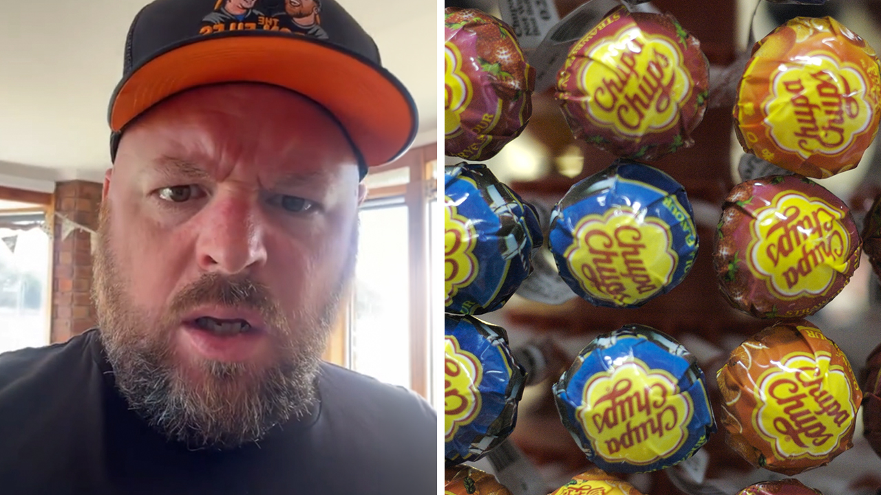
Influencer Nathan Hepburn was among those caught off guard after hearing what was presented as the correct pronunciation in a TikTok by James W. Keyes, the former CEO of Blockbuster and 7-Eleven. Hepburn then shared his disbelief online, saying, “I grew up calling them Chupa Chups. The original ad in Australia said Chupa Chups. Now I find out that it’s Choopa Choop?”
@theactualbaron ♬ original sound – The Baron
His reaction struck a chord, with his clip notching up more than two million views and drawing a wave of comments from Australians insisting they have always said it differently. “It’s not choopa choop! The audacity!” one person wrote. “He just ruined my childhood,” said another. A third added, “WTF is choopa choop? Never heard that in my life!” Others were resigned to the fact they might have had it wrong all along, including, “I’ve been saying it wrong my entire life,” while many still vowed they would keep calling the lollies “Chupper Chupps”.
Chupa Chups’ brand manager for Australia and New Zealand, Amelia Goldsmith, said the uproar was entertaining and also revealing. “But it really just shows how deeply people connect with the brand. Everyone has their own way of saying it, and honestly, that’s part of the fun,” she said.
Goldsmith also shared a lesser-known piece of Chupa Chups history that surprised many viewers: the story behind its instantly recognisable logo and the famous artist involved. In 1969, founder Enric Bernat collaborated with Salvador Dalí, an acquaintance who helped create the look that still defines the brand today. “As the story goes, Dalí sketched the now-iconic daisy-shaped logo in under an hour during a casual meeting – reportedly on a newspaper,” Goldsmith said. “He also insisted it be placed on top of the lollipop so it would always be clearly visible. “It’s a design that has remained largely unchanged – and instantly recognisable – ever since.”