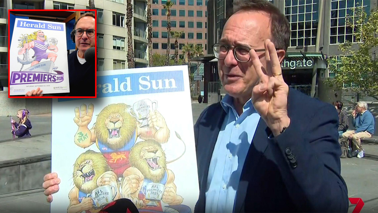
For more than 70 years, the AFL premiership poster has been one of footy’s simplest traditions: draw the winning team’s mascot looking suitably triumphant, print it quickly and let jubilant supporters wave it around while wondering how they are going to get home.
Apparently, things are a little more complicated these days.
Veteran cartoonist Mark Knight has revealed the surprising amount of discussion that went into his potential 2026 premiership posters for Brisbane and Fremantle, with both clubs requesting changes to the way they were depicted.
And when we say changes, we are talking about everything from the masculinity of a Docker to the finger positioning of a lion.
The premiership poster tradition dates back to 1954, when legendary Herald cartoonist William Ellis Green, better known as WEG, produced his first grand final poster. Knight took over the cherished assignment following WEG’s death in 2008 and has continued producing the instantly recognisable cartoons ever since.
But Fremantle presented him with something of a creative challenge this year apparently.
Knight said his original design featured “a big, beautiful wharfie Docker with his anchor” – a fairly traditional interpretation of a club called the Dockers.
According to Knight, however, Fremantle felt the character was too aggressive.
“They didn’t like it. It didn’t fit with their new, ‘anti-fierce masculine nature’ feeling at the club. It was too aggressive,” Knight said.
He claimed the feedback was that the club wanted something more reflective of its modern supporter base, which he colourfully described as the “hipster, man-bun, long-hair, nose-ring, latte-sipping crowd”.
Knight said he was told the original image didn’t fit the direction of the club and that Fremantle was not celebrating “uber-masculinity”.
The result was a rethink of the Docker.
Fremantle president Chris Sutherland, however, has pushed back on Knight’s version of events, saying the club did provide feedback but denying it had specifically asked for the character to be “de-wharfied” because of concerns about masculinity.
“What is true is that every year, I think Mark Knight provides a draft of the cartoon for the two grand final teams to give feedback,” Sutherland told 6PR.
He said Fremantle simply wanted to ensure the image represented the “broader church that we are today”, noting that the finished character was still a wharfie – complete with a Docker tattoo.
Asked whether being a latte-sipping hipster was now a prerequisite for Fremantle membership, Sutherland replied: “Definitely not. I still like drinking at the local Fremantle pubs.”
Brisbane’s concern was considerably more specific.
Knight’s Lions poster featured a triumphant lion holding up a paw, but the club noticed something potentially troublesome about its fingers.
“I had the fingers together and the club said, ‘no, that looks like a salute from The Hunger Games,'” Knight told 7NEWS.
For anyone whose knowledge of The Hunger Games begins and ends with wondering whether it is something the grandchildren watch, the three-finger salute is a symbol associated with resistance in the hugely successful series.
Knight’s solution was refreshingly straightforward.
“I pulled the fingers apart and everybody was happy,” he said.
Thus one of football’s great traditions survived another potential crisis: the lion’s fingers were successfully separated and the Docker emerged suitably representative of Fremantle’s broad church.
The revelations have inevitably prompted plenty of debate, with some observers arguing clubs should leave Knight alone to do what cartoonists have always done – exaggerate, poke fun and occasionally annoy people.
Others felt the clubs were perfectly entitled to have a say in how their identities were represented on an official premiership product.
Either way, the humble grand final poster has clearly come a long way since WEG first picked up his pen in 1954. Back then, drawing a football mascot required ink, imagination and a deadline. In 2026, it appears you also need brand guidelines, stakeholder feedback and a detailed understanding of acceptable lion finger spacing.
Welcome to modern footy.