Placeholder Content Image

10 tips for cleaning your car’s interior

<h2>Clear rubbish</h2> <p>Before you pull out the vacuum and cleaning supplies, clear out all the obvious rubbish. Check everywhere thoroughly. There will likely be rubbish on the floor, under the seats and in the seat cracks. Toss out any wrappers, bottles, toys and other objects that your vacuum can’t handle.</p> <h2>Tackle floor mats</h2> <p>Pull the floor mats out of the vehicle and shake them out as much as possible. This will make vacuuming easier. Scrub them with soap and hot water or a foaming carpet cleaner and allow them to air dry completely before reinstalling them.</p> <h2>Vacuum, vacuum, vacuum</h2> <p>Vacuum both front and back seats, the floor and, if necessary, the boot. Vacuum every area of the vehicle where you can get the nozzle, including under the pedals and along the side door panels.</p> <h2>Wipe away grime</h2> <p>Now that the car is vacuumed, grab a soft cloth or cleaning wipes to wipe up all that dirt, sticky stuff and dust. You can also spray a small amount of car-specific cleaner over the console, steering wheel and the area between the seats to restore that new-car look.</p> <h2>Clean cup holders</h2> <p>Cup holders can harbour grime – and the residue from sticky spilled drinks. Try using a cotton swab dipped in a little cleaning solution to reach those difficult areas.</p> <h2>Wipe windows</h2> <p>Spray a window cleaner solution on windows and wipe clean with a paper towel or microfibre cloth. You can also mix one cup of water, two tablespoons of vinegar and one cup or rubbing alcohol for an effective homemade window cleaner.</p> <h2>Attack stains</h2> <p>If there are stains on the seats or on the carpet (and we guarantee there will be, especially if you have kids!) try this homemade solution. In a spray bottle mix two cups of water, one cup of vinegar and about a tablespoon of dish soap. Spray on the stains and let it sit for 15 minutes. Then wipe clean with a wet cloth. If the stain persists, try a stain remover. Spot-test in an inconspicuous area to make sure the upholstery fabric is colourfast.</p> <h2>Remove pet hair</h2> <p>If you have a dog, you know the pain of dealing with pet hair in the car. If the vacuum doesn’t remove all the fur, try using a rubber-dipped glove. Simply brush the hair away with your hand, and it sticks to the glove like magic! To protect your car’s interior from any future pet damage, try a waterproof seat protector.</p> <h2>Get into crevices</h2> <p>Grab a paint stirrer or two next time at you’re at the hardware store. Wrap an end with a microfibre cloth and use the stick to get into those hard-to-reach areas between the seats and around the centre console.</p> <h2>Freshen up</h2> <p>Create a homemade car freshener with one cup of baking soda and five drops of your favourite essential oil. Place both the soda and oil in a sealable plastic bag or glass jar for 24 hours. Then shake it up, sprinkle on the car’s floor and let it sit for 20 minutes. When the time has passed, vacuum up the baking soda. The scent will linger, making your car smell fresh and clean!</p> <p><em>Image credit: Shutterstock</em></p> <p><em>This article originally appeared on <a href="https://www.readersdigest.com.au/food-home-garden/home-tips/10-tips-for-cleaning-your-cars-interior" target="_blank" rel="noopener">Reader's Digest</a>.</em></p>

Home Hints & Tips

Placeholder Content Image

Interior designer shares key things that make your home look “cheap”

<p dir="ltr">Everyone has their own unique way of decorating their home, finding the perfect aesthetic to make your space your own.</p> <p dir="ltr">And while there are limitless ways to jazz up your home, there are a few major faux pas that can instantly turn your space from fab to drab. </p> <p dir="ltr">An expert interior designer has gone viral on TikTok for listing the three things to look out for when decorating your home in order to avoid your space looking “cheap” or “tacky”. </p> <p dir="ltr"><strong>Visible cords</strong></p> <p dir="ltr">Her biggest no-no was having electrical cords for all your chargers and appliances on show. </p> <p dir="ltr">She said they can make any space look “cluttered”, and recommends hiding cords behind special covers of under furniture. </p> <p dir="ltr">“You can run your cords through the wall if possible and if not you can get a little case from Amazon. So much better,” she said.</p> <p dir="ltr"><strong>Mass-produced artworks</strong></p> <p dir="ltr">Another thing the designer recommends avoiding is generic, mass-produced artwork that you find in home department shops. </p> <p dir="ltr">“When you're looking for artwork, look for something a little bit more original, something that not everyone will have,” she said.</p> <p dir="ltr">She also advised against cluttering a space with too much art, and recommended focusing on one main focal piece instead. </p> <p dir="ltr"><strong>Tacky decor </strong></p> <p dir="ltr">The design expert also warned against tacky pillows, decor pieces and anything with an inspirational quote. </p> <p dir="ltr">She told all shoppers to steer clear of anything that boasts the words “Live, Laugh, Love”, and encouraged people to pick more classic and timeless decor options. </p> <p dir="ltr">While some appreciated the designers tips, others encouraged people to decorate their homes however they see fit. </p> <p dir="ltr">“What if I am cheap?” one woman asked.</p> <p dir="ltr">“Things that make my house look cheap: no money,” another quipped. </p> <p dir="ltr">“If it makes you happy then it's not cheap,” another said.</p> <p dir="ltr">“Just let people be happy with whatever they like and can afford,” one annoyed fan said.</p> <p dir="ltr"><em>Image credits: Getty Images</em></p>

Home & Garden

Placeholder Content Image

Update your home interior with these stylish tips

<p dir="ltr"> If your home needs a revamp, it’s reasonable to think a major change is needed to see any difference - but you might be surprised to find that even the smallest of changes can add some new life into your home’s interiors.</p> <p dir="ltr">Andrea Lucena-Orr, Dulux’s Colour and Communications Manager, says making your home reflect your unique style that just a couple cans of paint could be all you need.</p> <p dir="ltr">“People often underestimate the power of paint as a cost-effective and impactful way to jazz up your space,” she says. “Additionally, colour can be introduced in a number of ways to help tailor and refresh interiors, all whilst keeping the structure and integrity of the home intact!”</p> <p dir="ltr">Paint can be a particularly helpful tool in revitalising your space if you’re renting and can’t knock down walls to your heart’s content, or if you’re looking for change that won’t cost an arm and a leg.</p> <p dir="ltr">To prove just how effective painting can be at revitalising your space, Dulux Trend Forecaster and Stylist, Bree Leech, took to her own rental home with a paintbrush or two.</p> <p><span id="docs-internal-guid-2fce05c2-7fff-1636-6c0d-fffb27457698"></span></p> <p dir="ltr">“Our dining room had a feature that didn’t work for us and I’d wanted to fix it for some time!” Bree explains. “It was a neutral space that had a cut-out in the wall so you could look through the adjoining room. The cut-out feature was serving no real purpose and the dining area just felt a bit flat.”</p> <p dir="ltr"><img src="https://oversixtydev.blob.core.windows.net/media/2022/06/home-interiors1.jpg" alt="" width="1280" height="720" /></p> <p dir="ltr"><em>Before and after Bree Leech revamped her dining room with a lick of paint and some simple changes. </em></p> <p dir="ltr">She solved this problem with fluted wall panels that covered the cut-out feature, which she then painted with bright colours that were fun, joyful, and reflected her personal style.</p> <p dir="ltr">Those wanting to achieve something similar won’t have to work it all out on their own either, thanks to these tips from Bree herself.</p> <p dir="ltr"><strong>Colour isn’t just for walls</strong></p> <p dir="ltr">Bree says: “Painting dining chairs or a table is also a great way to achieve this look whilst renting. Add artwork that references your colour scheme to bring it all together.”</p> <p dir="ltr">But, Bree adds that having an overall mood or style is critical for selecting colours.</p> <p dir="ltr">“When selecting colours, always have an overall mood or style in mind and select colours that help bring this idea to life. It’s helpful to have a visual you can refer to like a mood board, materials board or a Pinterest board,” she explains. “This helps keep your colour scheme cohesive and gives you a reference point to work out your proportions as this can dramatically change the mood of the space.”</p> <p dir="ltr"><strong>Small changes work just as well as going bold</strong></p> <p dir="ltr"><span id="docs-internal-guid-a17f3c09-7fff-5f3c-5231-ab6c37bc7f85"></span></p> <p dir="ltr">“When it comes to scheming, going bold with colour can really pay off but equally, small changes can make a big difference,” Bree says. “If you want to introduce smaller pops of colour, choose furniture items or highlight small areas of a wall, door or even your ceiling.”</p> <p dir="ltr"><img src="https://oversixtydev.blob.core.windows.net/media/2022/06/home-interiors2.jpg" alt="" width="1280" height="720" /></p> <p dir="ltr"><strong>Work with what you have</strong></p> <p dir="ltr">If you’re renting or following a strict budget, you may need to work with the existing fittings and features - but that doesn’t mean you’ll need to compromise on your style.</p> <p dir="ltr">“Working with existing fittings and fixtures can often mean a clash in colourways,” Bree adds. “While you may not be able to pull up the carpet or replace the kitchen benchtop, you can always add rugs for a tonal effect to get you closer to your desired palette. Dulux also offers a wet room coatings range (Renovation Range) which allows you to paint over existing benchtops, cabinetry and tiles for a bespoke, premium look.”</p> <p dir="ltr"><strong>Test your colours with this simple trick</strong></p> <p dir="ltr">Since the colours you see in-store might look different in your home (or even at different parts of the day), it’s worth testing how the colour will look before you decide using this hack from Bree.</p> <p dir="ltr">“Paint a cardboard slip or piece of paper and leave the painted swatch up on the walls for a few days,” she says. “Move it around the room at different times of the day to ensure you love the colours(s) under different lighting conditions – both natural and artificial.”</p> <p dir="ltr"><span id="docs-internal-guid-fcffa6b1-7fff-aa38-0e20-fc649c1624fa"></span></p> <p dir="ltr"><em>Images: </em><em>Dulux Colour Forecast 2022 - Wonder Palette, Bree Leech (Dulux Colour Forecaster &amp; Stylist), Mike Baker (Photography), Wall Panel: Colour -</em><em>DULUX Harmonious, Product - DULUX Wash&amp;Wear, Supplied by Surround by Laminex; Chairs: Colour - DULUX Plunder, Product -</em><em> DULUX Aquanamel; </em><em>Rug supplied by Halcyon Lake </em><em>(</em><em>Supplied)</em></p>

Home Hints & Tips

Placeholder Content Image

See all the rooms from The Block that didn’t make it to air

<p dir="ltr">It turns out there were a lot of rooms that didn’t make it to air on this season of<span> </span><em>The Block,<span> </span></em>and we’ve<span> </span><a rel="noopener" href="https://9now.nine.com.au/the-block/2021-rooms-you-didnt-see-kirsty-jesse-josh-luke-mitch-mark-s17/33df6004-8d65-4878-bb40-8fbffeb13e0f#1" target="_blank">finally been given a look</a><span> </span>at all the work the teams did that we didn’t get to see on TV.</p> <p dir="ltr">The never-before-seen rooms include a fourth bedroom from winners Mitch and Mark, another bedroom, bathroom, rumpus room, stairs, and second storey hallway from Kirsty and Jesse, and changes to Josh and Luke’s living and dining rooms, fourth bedroom, and wine cellar/home cinema.</p> <p dir="ltr">Mitch and Mark added a glass catwalk above the stairs to the basement, which lets light flow through to downstairs. Meanwhile, their fourth bedroom is in keeping with the pared back aesthetic used throughout the rest of the house, utilising neutral tones to create a room that suits any taste and can be easily transformed.</p> <p dir="ltr">Josh and Luke managed to fix their entryway, and switched the locations of their living room and dining room per the judges’ suggestion. The living room features an entertainment unit made by Christian Cole, who also designed the dining table and kitchen benchtop.</p> <p dir="ltr">As for the twins’ fourth bedroom, they removed the en suite to make a bigger bedroom, and added a bed, which is tucked behind a wall. To replace the en suite, they added another bathroom behind the garage. They also revamped their wine cellar/home cinema, which judge Shaynna Blaze described as a “festering pit of negativity”. They added a pool table and a cosy-looking sofa and armchairs.</p> <p dir="ltr">They also reworked their second guest bedroom, changing textures and colours to better complement those used in the rest of the house.</p> <p dir="ltr">Kirsty and Jesse had the largest, and only two-storey, property on the show, so they naturally completed more rooms than were shown to the judges. The staircase that leads to their second floor is minimalistic, as is their rumpus room, in order to show buyers how it can be transformed.</p> <p dir="ltr">The couple’s bathroom is a simple design that allows the owners to put their own stamp on it once they move in, and includes lots of storage. For their fourth bedroom, they kept the blue and white Hamptons palette seen throughout the rest of the house.</p> <p dir="ltr"><a rel="noopener" href="https://oversixty.com.au/property/real-estate/they-ve-hit-the-market-first-look-inside-the-block-homes" target="_blank">All of the homes are located</a><span> </span>on Bronte Court in Hampton, Victoria, and are roughly priced between $2.6 million and $2.8 million - $450,000 above the area’s median house price of $2.15 million.</p> <p dir="ltr"><em>Image: Channel Nine, Don Arnold/WireImage</em></p>

Real Estate

Placeholder Content Image

Which interior design rules to follow – and which to break

<p>When you're in decorating doubt there are some steadfast rules to live by.</p> <p>"Always have some form of contrast in a room," says Victoria Bibby of Bibby and Brady.</p> <p>Whether it's with opposing colours like black and white, warm wood tones balanced with cool blues, contrasting textures or all of the above, it's a rule to follow if you're wanting to avoid a monotonous look. </p> <p style="text-align: center;"><img src="https://resources.stuff.co.nz/content/dam/images/1/m/9/1/a/x/image.related.StuffLandscapeSixteenByNine.620x349.1m8opb.png/1508448531682.jpg" alt="Blue and yellow are complementary colours, they appear on opposite sides of the colour wheel." class="photoborder"/></p> <p>To achieve balance use the 60-30-10 rule. </p> <p>The idea is that 60 per cent of the room should be made up of wall space and large key pieces, 30 per cent of the room is comprised of medium scale accent pieces, smaller bits of furniture and area rugs; and the final 10 per cent is smaller accent pieces such as art and decor items. </p> <p>When you think about it in colour terms, 60 per cent of a room's hue should be achieved through the walls and anchor furniture. This is the main colour in your palette. </p> <p>Thirty per cent of the colour in your room will come through furniture, textiles and lighting. These pieces should be shades in the same colour family as the dominant hue on the walls and key pieces. </p> <p style="text-align: center;"><img src="https://resources.stuff.co.nz/content/dam/images/1/m/9/1/a/w/image.related.StuffLandscapeSixteenByNine.620x349.1m8opb.png/1508448531682.jpg" alt="There are some guidelines that lead you to the path of interior genius, but you don't always have to play by the rule book." class="photoborder"/></p> <p>The final 10 per cent is the option to introduce different colours, patterns and textures that complement the dominant colour. </p> <p>"We recommend three to four main colours in a room," says Bibby. </p> <p>Basic colour theory suggests colours on opposites sides of the colour wheel are complementary (opposites attract). Colours in the same temperature will also work well together.  </p> <p style="text-align: center;"><img src="https://resources.stuff.co.nz/content/dam/images/1/m/9/1/a/y/image.related.StuffLandscapeSixteenByNine.620x349.1m8opb.png/1508448531682.jpg" alt="Mixing metals adds visual interest into a space. Here brass accents work with chrome finishings on the ceiling fan and ..." class="photoborder"/></p> <p>With patterns, Bibby says, "keep them within your colour palette of three to four colours. Always mix small patterns with a large pattern for contrast." </p> <p>And make sure your rug is large enough. "They are such a key piece in a room for defining the zone and adding warmth and texture," she says. "It's our number one pet peeve to see one that's too small for a room." </p> <p>A rug should ground all the furniture, not just the coffee table. "Always have at least two legs of your chairs and sofas on the rug," Bibby suggests. </p> <p style="text-align: center;"><img src="https://resources.stuff.co.nz/content/dam/images/1/m/9/1/a/u/image.related.StuffLandscapeSixteenByNine.620x349.1m8opb.png/1508448531682.jpg" alt="Mixing prints shouldn't be a taboo topic. Here a combination of animal and tribal print make for a cosy and interesting ..." class="photoborder"/></p> <p>Odd numbers have been interior decor's best friend forever, and there's a reason why. Even numbers create symmetry, but odd numbers are engaging - often why three it is considered interior design's golden number. When thinking about grouping furniture, hanging photos on a wall or arranging objects on a table, think odd. </p> <p>The last design rule Bibby swears by is always hanging curtains as high as possible, and always to the floor. </p> <p>"Hanging them high will create a sense of space and elegance in a room," she says. Always drop them to the floor unless there is furniture in the way or the window is too high or too small then use a blind instead. </p> <p><strong>The rules you can break </strong></p> <p>Forget the rule that all your metals must match. Or your woods, says Bibby. </p> <p>Combining gold, copper, silver or iron is not a taboo but in fact a great way to add interest into the decor.</p> <p>"Don't be afraid to have brass cabinet handles and a chrome tap, it's way more interesting!" </p> <p>Small furniture for a small room? Forget it, says Bibby. </p> <p>"It's easy to see why this is the immediate option, but you're in danger of making the room feel cluttered and a bit like a doll's house."</p> <p>She suggests large furniture can actually make a small space feel bigger and create a sense of comfort. </p> <p>Mixing patterns used to be a no-go zone. Jarring prints and clashing colours were to be feared.  </p> <p>But, as it turns out, stripes and florals, or polka dots and checks work effortlessly together to inject some personality into a space. </p> <p><em>Written by Bea Taylor. Republished with permission of <a href="http://www.stuff.co.nz/" target="_blank"><strong><span style="text-decoration: underline;">Stuff.co.nz</span></strong></a>. Image credit: Jane Ussher</em></p>

Home & Garden

Placeholder Content Image

Qantas reveals secret design hack that will change flying in economy forever

<p>As rival airlines try to cram more passengers in like sardines, Qantas has announced a game-changing secret feature that will making economy class on the Flying Kangaroo’s new Dreamliner aircraft more comfortable than ever.</p> <p>Aside from limiting the number of economy passengers to 166 to reduce cramping, Qantas has announced it would be creating a spring-loaded foot net as the base of the seat in the front, which passengers can place their feet inside.</p> <p>This is a step away from traditional foot rests, cradling passenger’s feet and calves and providing more solid support on long-haul journeys around the world.</p> <blockquote class="twitter-tweet"> <p dir="ltr">Awesome leg room and footrest <a href="https://twitter.com/Qantas?ref_src=twsrc%5Etfw">@Qantas</a> 😐 <a href="https://t.co/mBz16bi0eq">pic.twitter.com/mBz16bi0eq</a></p> — Husky (@mrhuskyhusky) <a href="https://twitter.com/mrhuskyhusky/status/878786955328184321?ref_src=twsrc%5Etfw">June 25, 2017</a></blockquote> <p>The new flight also comes with specially design bespoke fabrics, mood lighting and special trays to hold tablets and make the overall economy experience more enjoyable.</p> <p>The new fleet of aircraft reportedly also have integrated “advanced technology” to help reduce turbulence, as well as improved entertainment options.</p> <p> “One of the main features is the wing. It’s made of composite fibre. You can also expect larger windows, better air quality to help reduce jet lag, and ride dampening technology to reduce the effects of turbulence,” said Qantas Captain Alex Passerini.</p> <p>What are your thoughts? Do you fly with Qantas?</p> <p><a href="http://www.oversixty.com.au/travel/travel-insurance/?utm_source=over60&amp;utm_campaign=travel-insurance&amp;utm_medium=in-article-banner&amp;utm_content=travel-insurance" target="_blank"><img src="http://media.oversixty.com.au/images/banners/Travel-Insurance_Website_GIF_468x602.gif" alt="Over60 Travel Insurance"/></a></p>

International Travel

Placeholder Content Image

5 key elements you need to create a timeless interior

<p>“If you can create something time cannot erode, something that ignores the eccentricities of particular eras or moments, something truly timeless… this is ultimate victory.” – Dr Ferry Porsche.<br />    <br /> When attempting to create a timeless interior, it’s important to be clear about your interior decorating style, while also considering past, present and future trends.  Here are five key elements that will enable you to create a timeless foundation that you can develop – or easily reinvent – over time.</p> <p><strong>1. Choose open-plan design</strong><br /> Open-plan living provides a seamless transition through different areas of the home and allows a unified approach to interior design. Particularly notable is the relationship between the kitchen, dining and living areas. To create a <span style="text-decoration: underline;"><strong><a href="https://www.houzz.com.au/ideabooks/52781767" target="_blank">seamless relationship between zones</a></strong></span>, consider carrying your flooring, colour scheme, any motifs or lighting styles through both spaces.</p> <p><strong>2. Go for white walls and ceilings</strong><br /> White walls and ceilings create continuity in open-plan spaces, while providing a blank canvas to evolve your decor at any time.</p> <p>With so many variations of white paint available, it’s important to select the white that best suits your interior style and the feeling you want to create in your home.</p> <p><span style="text-decoration: underline;">Cool whites</span>: Ideal for neutralising bright light in spaces abundant with natural light, the crispness of cool whites also makes them a popular choice for modern and minimalist decorating styles. With a black or blue base, start your search with Dulux “Vivid White” or Porter’s Paints “Milk”.</p> <p><span style="text-decoration: underline;">Warm whites</span>: If you want to make a room feel more inviting or have a lot of natural textures in your home, then warm whites are for you. With yellow, brown or red bases, my favourite is Dulux “Antique White USA”, but other popular warm whites include Taubmans “Plain Vanilla” and Porter’s Paints “Long Grain”.  </p> <p>As you start to <span style="text-decoration: underline;"><strong><a href="https://www.houzz.com.au/ideabooks/66783321" target="_blank">investigate whites</a></strong></span> you may also be drawn to greys. Cool greys are ideal for glamorous spaces, whereas warm greys set a more relaxed tone.</p> <p><strong>3. Think about your flooring</strong></p> <p>We’ve moved past the days where carpet dominated flooring choices at home. As hard flooring takes its place, texture is moving to the forefront. Here are some good textural options:<br /> <br /> <span style="text-decoration: underline;">Timber</span>: Oak is a popular timber choice as its grain adds just the right amount of texture to suit any interior style. From the blonde oaks that are seen in Scandinavian decorating styles to dark chocolate tones that amp up the glamour, the variation of tints make oak easy to team with your style. Spotted gum, blackbutt and other Australian species are growing in popularity, and their distinctive grains and colours make them a good match for timeless interiors.</p> <p><span style="text-decoration: underline;">Polished concrete, stone or tiles</span>: These look classic in various shades of grey. Selected in this instance as an alternative to timber, they are also useful in wet areas of the home, such as laundries and bathrooms, where timber flooring is not as suitable.</p> <p><span style="text-decoration: underline;">Carpet</span>: Carpet provides a luxurious foundation to sink your feet into and works particularly well in bedrooms or other secluded areas of the home that aren’t high in traffic and suit softness underfoot. With timelessness in mind, it’s hard go to past twist or textured carpet designs. While both styles are easy to maintain and work well with all interior styles, a twist carpet is ideal if you have pets, as their claws are less likely to get stuck in the fibres.</p> 
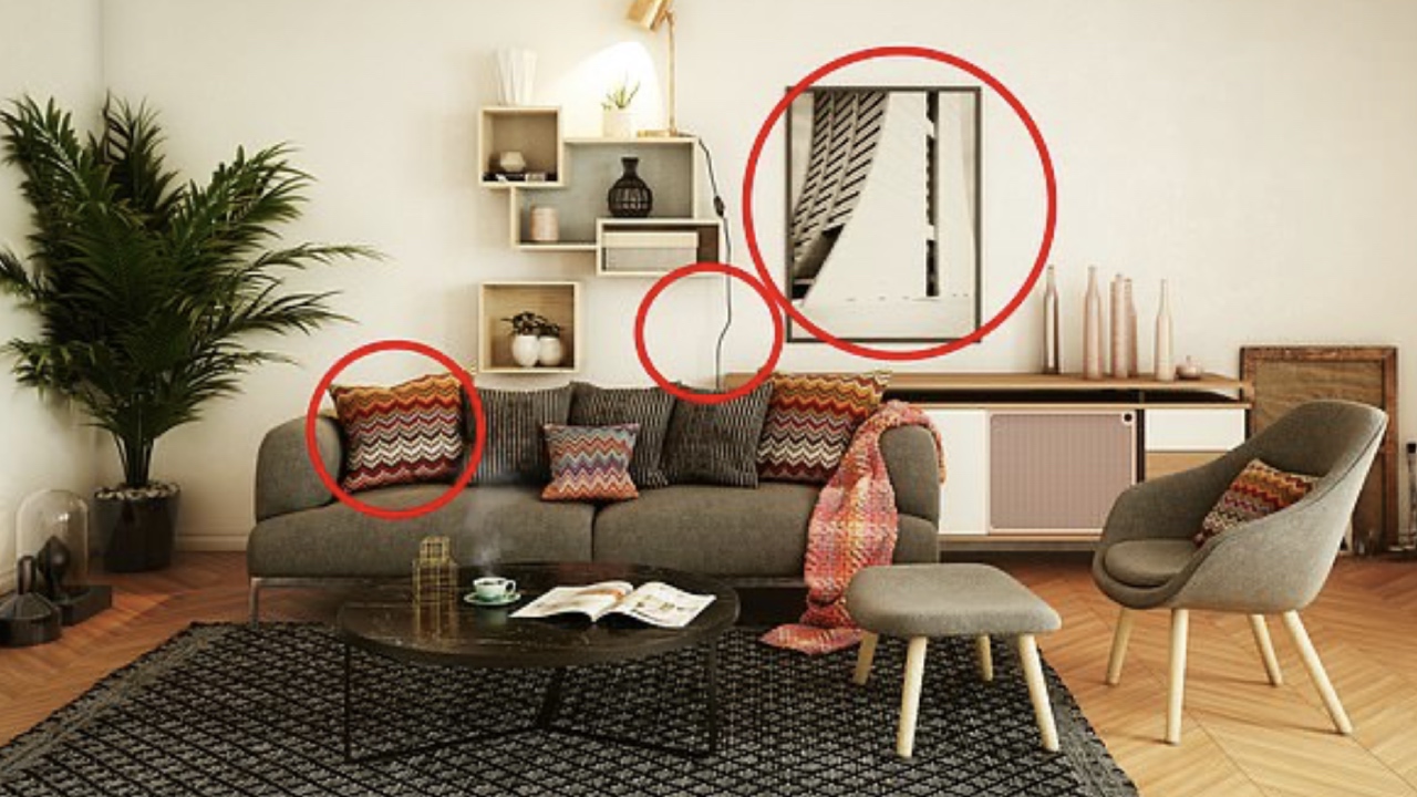
<p><span style="text-decoration: underline;">Rugs</span>: Rugs enable you to enhance your interior style, while softening the sound, and defining zones within a larger area. When it comes to rug fibres and textures, it’s best to be guided by the look and feel you want to create – keeping in mind that timelessness is about quality not quantity.<br /> <br /> Tip: Selecting the right size rug for your space is key and one of the best ways to determine this is by using a sheet. Simply place a sheet down in the area you want to place a rug in and play with the size of the sheet and placement of your furniture until you find a balance you’re happy with.</p> <p><strong>4. Move to metals</strong><br /> From stainless steel and chrome, to copper and rose gold, metallic finishes have a lifelong appeal. Ideal for lamps, fixtures, vases and other smaller accessories, keeping metallics as accents within your interior scheme will allow it to remain timeless while <span style="text-decoration: underline;"><strong><a href="https://www.houzz.com.au/photos/industrial/australia" target="_blank">adding character</a></strong></span> to your home.</p> <p>Although it’s important to stay true to your interior style, don’t be afraid to challenge conventional thinking by mixing different metallic finishes in the same space.  This kitchen provides a good example as the stainless-steel appliances and fittings recede into the background while the copper light fittings take centre stage.</p> <p><strong>5. Select clean, simple lines</strong><br /> Choosing streamlined fixtures, fittings and appliances allows them to seamlessly tie into your interior. You can either:</p> <p>Make your fixtures fit in with your wall colour: If you prefer a minimalistic approach or have selected statement pieces throughout your space, then consider following the lead of this interior, which ties the tones and textures of the kitchen cupboards and stainless steel appliances into the hue on the walls.</p> <p>Or mix it up: If your decorating style embraces different textures, or you’re looking to do something a little different to the norm, then select a different material, colour and/or texture (timber, metallic, glass or statement colour) for cupboards, splashbacks, benches, or fixtures and other fittings.</p> <p>This kitchen is a good example, utilising American oak veneer (un-stained with a sprayed clear coat) for the cupboards and extended ceiling in addition to a black veneer bench, the streamlined design creates a statement within the home while not overpowering the rest of the interior. It is this balance, between statement and a complementary streamlined design – that makes it timeless.</p> <p>As you combine these five key elements with your interior style, you’ll find you’ve created a timeless home to sit back and enjoy.</p> <p><em>Written by Emma Bolger. First appeared on <a href="http://www.domain.com.au" target="_blank"><strong><span style="text-decoration: underline;">Domain.com.au</span></strong></a>.</em></p>

Home & Garden

Placeholder Content Image

Get the look: French provincial interiors

<p>Chic and cosy, French provincial-style interiors are a reflection of the homes in Provence in the South of France in the 17th and 18th century. Inspired by the landscape, sprawling farmhouse tables, stone floors and rough plastered walls, think a neutral colour palette combined with rustic finishes, ornate details, vintage pieces and a mix of wood, metal, wicker and rough, almost unfinished materials.</p><p>Today this style remains on-trend and will certainly make any space look light, airy and welcoming. These style tips will allow you to bring a touch of the look into your home in an elegant manner.</p><p>1. Feature an elegantly carved cabinet like this offering from IKEA (1), $698. You’d always find these in the kitchens and dining rooms in a French house during this period.</p><p>2. Adding hints of metallic, statement pendent lights and whites rather than creams can modernise the look. This candle (7) from Target, $8.40, is the perfect way to add a touch of the provincial look and offering a modern edge.</p><p>3. When choosing textiles, look out for traditional prints that take their cue from nature. Cottons or linen materials with a white and beige colour scheme work best. We love this cushion (4) by Linen House, $34.95. Lamps, like the linen shade (2) on this one from Fantastic Furniture, $25, are another way to introduce more texture to your interior.</p><p>4. For a modern look, mix vintage-feel pieces like this clock (3) from Target, $65, with modern furniture like this IKEA table and set of four chairs (5), $585. While the set has a French provincial feel it is not as detailed and thus adds a modern touch.</p><p>5. A great deal of the charm of the French provincial style is how inviting and personal it looks. Accessorise your home with rustic baskets, old copper pots, beautiful ceramics, wrought iron and fresh flowers. Tableware, like this gorgeous bowl (6) from IKEA, $3.99, is a great way to ensure your setting shows attention to detail.</p><p>&nbsp;</p>

Home & Garden

Placeholder Content Image

A guide to brightening your home for winter

<p>As the temperature drops and the days become shorter and darker, keeping the winter blues at bay is essential to staying happy and healthy. Here, Michelle Greeves, the creative director at Charles Parsons Interiors, shares her top five tips on how to keep your home bright and light this winter:</p><p><strong>Colour pop</strong><br>"Create a warming and welcoming space in your lounge by putting together a decorative table centrepiece filled with candles and bright flowers of your choice. The candles will not only create a warming feel but if you opt for scented ones, they will impart the smell of spring. Complement the scene with a beautiful table runner in a luxurious fabric to add the perfect finishing touch."</p><p>Note: Diptqyue candles like the Feu de Bois (6), $78, are a super indulgent way to light up your home and impart a warming scent into your space. Available at Mecca Cosmetica.</p><p><strong>All white now</strong><br>"Re-decorating or adding a splash of white paint throughout your home will create a more open and airy feel.&nbsp;For a quick fix, however, filling your home with white cushions, curtains, rugs, blankets and furniture will immediately make your home seem lighter and brighter. Use different textures to create depth and warmth in the mix, like the Shimmer Ivory Cushion (4), $52.95 and the Leon Cushion (2), $31.95 (both by Rapee)."</p><p><strong>In full bloom</strong><br>"Fresh flowers in bright colours, like pink or orange, will instantly uplift a room and create the feeling of a loved home. If, like me, you prefer not to replace flowers every few days, opt for something in a floral print. Curtains or cushions work well and will ensure your home stays in summer-mode all year round."</p><p>Note: Plants (1), real or fake, are a great way to bring of the outdoors in and add colour and texture to your interiors.</p><p><strong>Sorbet shades</strong><br>"Pastels and candy colours are on-trend in fashion and make-up through to interiors.&nbsp;Go for a modern twist on a classic colour combination by adding it to your home for a light-hearted feel. After all, what is more uplifting than the reminder of the childhood treats like fairy floss, sherbet and mints? Make a statement with reupholstered chairs in a dreamy blue or scatter a selection of cushions in various light hues to add pastel highlights to a room."</p><p><strong>Shimmer and shine</strong><br>"Eye-catching items that shimmer and sparkle will&nbsp;add a touch of glamour to your living areas for the winter months. Not only will these unique pieces demand attention, they will reflect the light and brighten your home. Stick to monochrome for a chic, elegant feel. Check out the Electric White shimmer cushion (3), $45 and Electric Throw rug (5), $66 (both by Rapee)."</p><p>&nbsp;&nbsp;</p><p>&nbsp;</p><p>&nbsp;</p><p>&nbsp;</p>

Home & Garden

Our Partners